NUORO A Brand Built on Blue Zone Culture
April 22, 2026
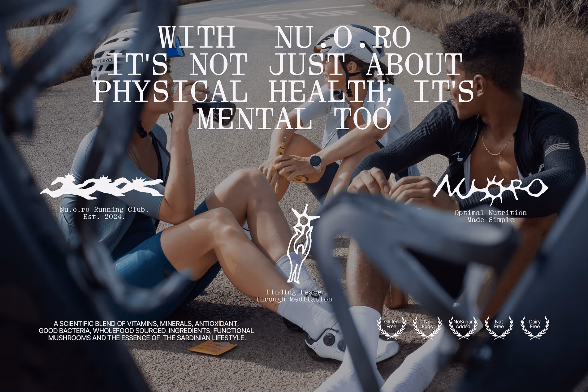

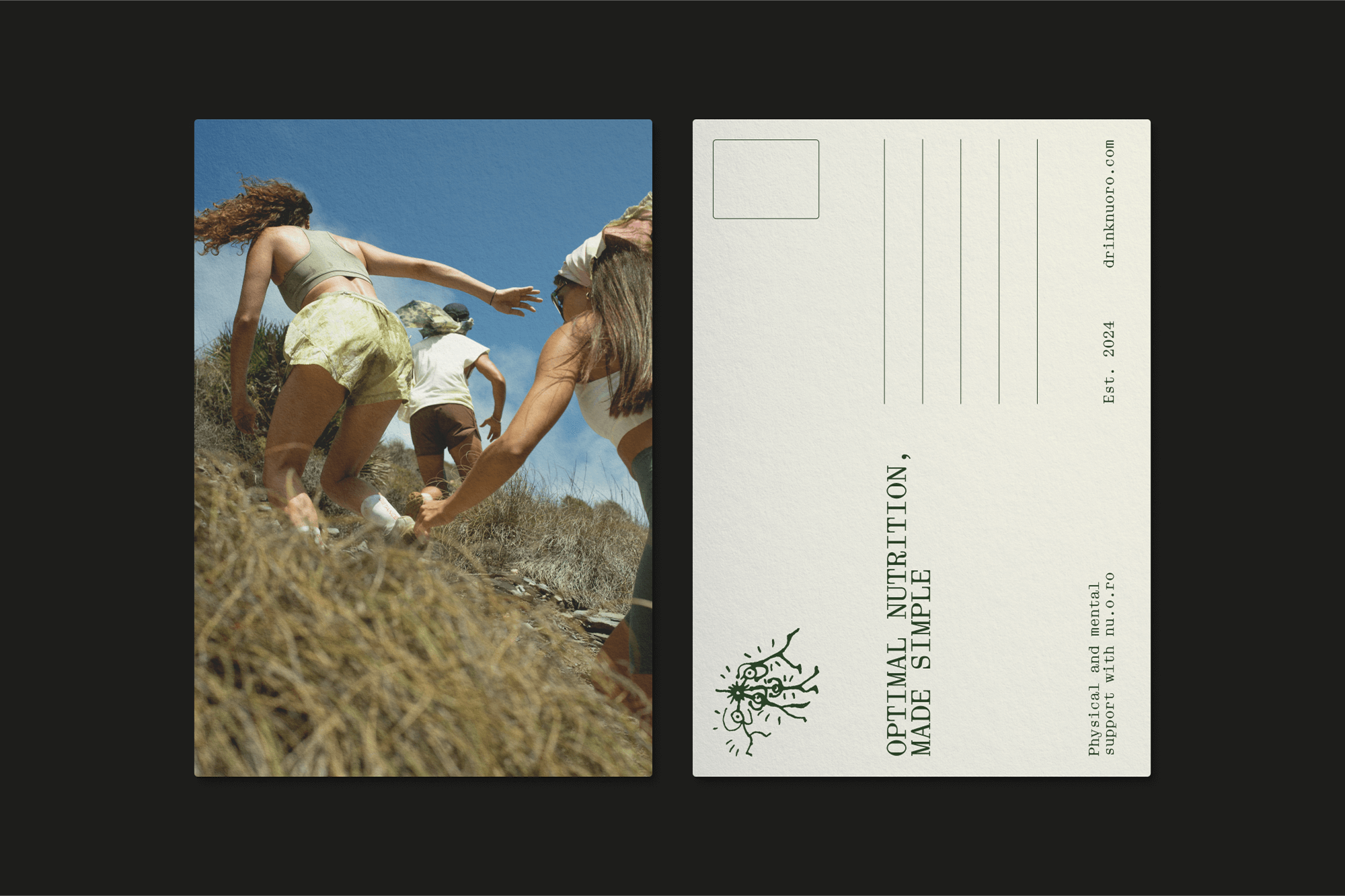
Before you get to the logo or the color palette, you have to understand what Nuoro is going for. The brand takes its name from a province in Sardinia. In the Nuoro province, in its mountain regions, where the locally born lived longer than those in the rest of the island. This is the first blue zone ever identified. A Blue Zone is a place where the secret to longevity is directly tied to traditional lifestyles that promote connectivity, low stress, natural movement, purpose, and healthy eating.

Onmi Design used this as the brand’s philosophy, to create a mediterranean wellness brand inspired by Ikigai, the Japanese concept of finding harmony between passion, mission, vocation, and purpose.
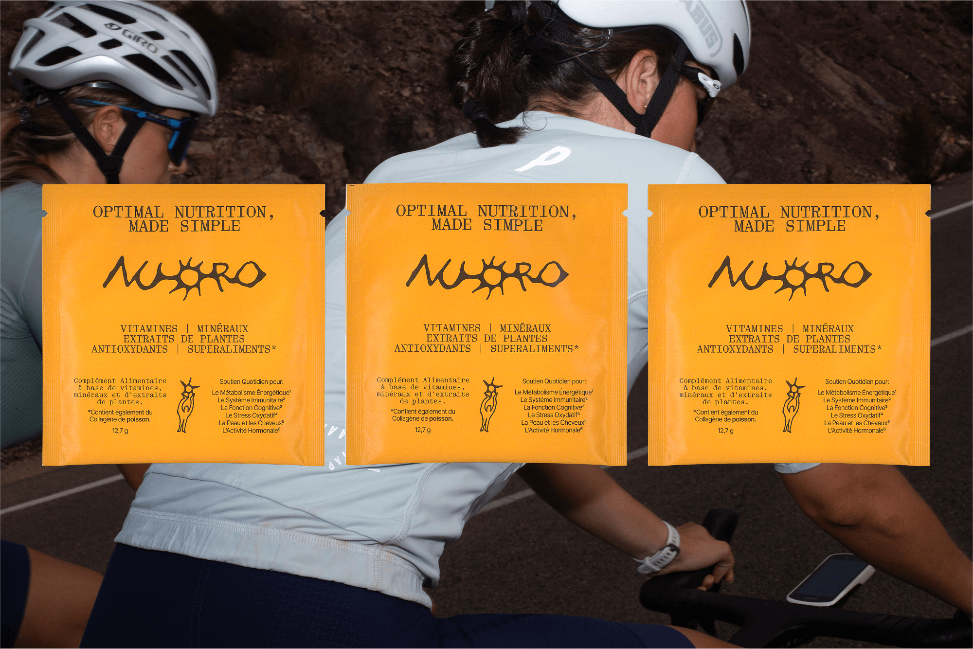

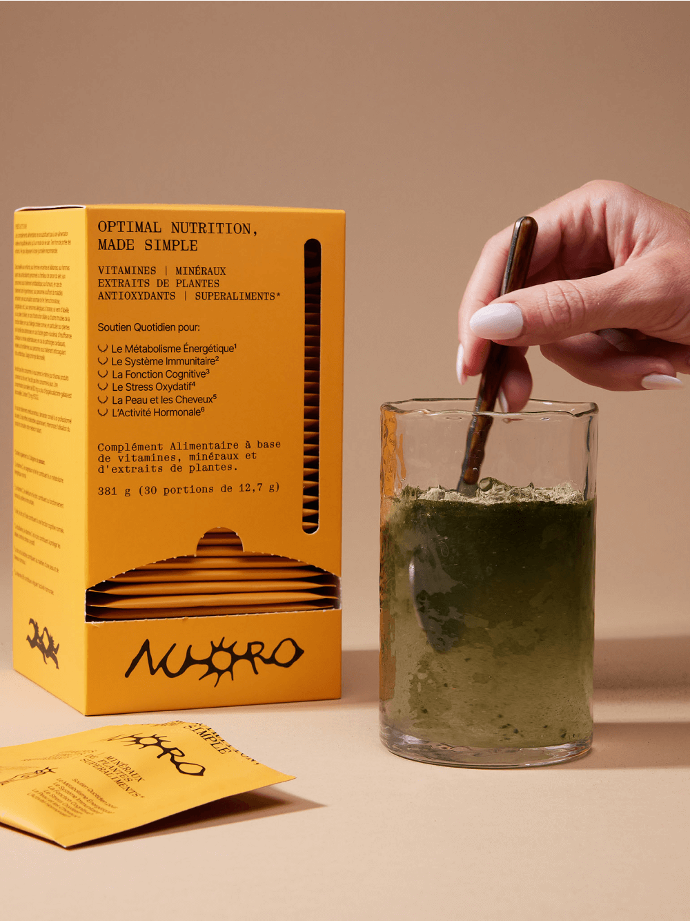
The worldmark leans into craft. It reads like pressed handmade paper or a stamp. Feels artisanal and clean. Omni called it “the union of tradition and modernity.”
The palette maps directly to the Mediterranean landscape. Sardinia’s interior boasts rugged mountains, forests, and agrarian plains.
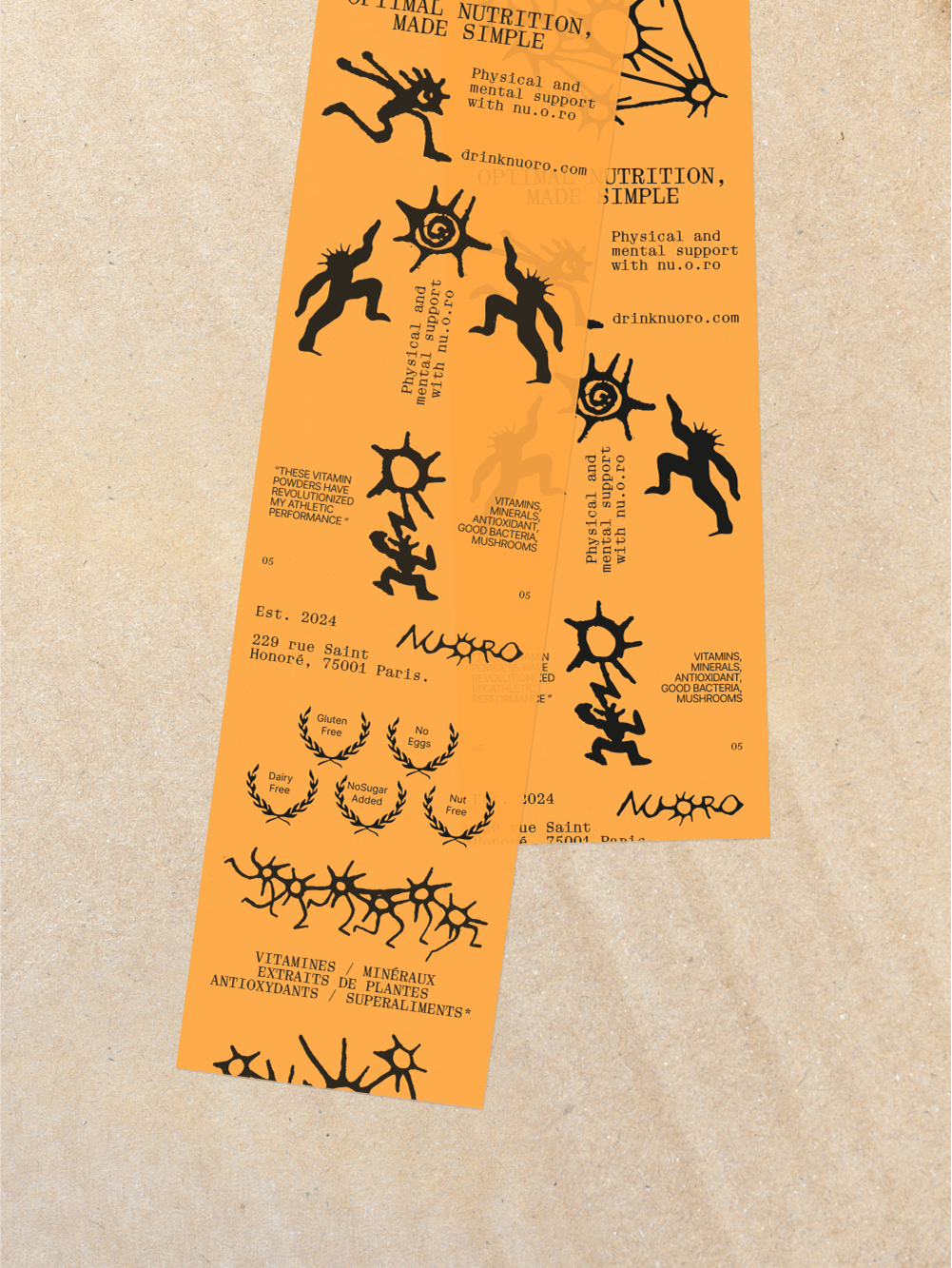
Nuoro uses Aether, set up by Barcelona based DDOTT Type Foundry.

The strongest brand identities are the ones where you can trace every visual decision back to a single idea. Due to geographic isolation, the genes and culture of Sardinia’s Blue Zone residents have remained mostly undiluted. Omni used that specificity as a design constraint

.avif)